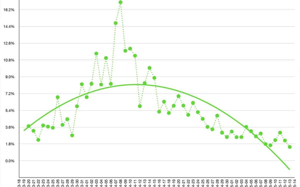
The green dot graph above is one that The Niagara Independent has put together daily since March. It shows the percentage of people in Ontario testing positive for the virus each day.
Throughout the last few months, doctors, epidemiologists, mathematicians and everyone in between have started to advance graphs and formulas to try to explain where COIVD-19 spread has been, is currently and where it’s going. There have been thousands of online debates about which measure is the best measure to determine which country has had the most success or the least success in dealing with COVID-19.
Now these measures are being looked at to determine the best time for opening of economies. Which measure matters most? Hospitalization trends; ICU trends; ICU ventilator patients; deaths; daily death rates; spread amongst general population vs. spread in long term care and retirement homes and so on.
The green dot graph above is one that The Niagara Independent has put together daily since March. It shows the percentage of people in Ontario testing positive for the virus each day.
Clearly at the beginning of the pandemic in Ontario, when there were low levels of total tests and when only the most symptomatic were being tested, the percentage of people testing positive escalated.
Using daily numbers provided by the province, the green dotted graph shows that in the first 10 days measured, March 19 to March 28, the percentage of people testing positive was around 3.6% per day. This was based on testing of between 1500 and 3300 people per day.
From March 29 to April 8, the percentage of people testing positive increased on a daily basis until it reached a peak of over 16% on April 9. The number of tests being done per day ranged from a high of 7500 to as low as 2500.
It was around this time that Premier Ford began to express his frustration that more testing wasn’t being done. He demanded that Public Health officials improve their performance and increase daily testing. He quickly got his way.
April 14 was the last day that saw fewer than 5000 tests completed. Tests quickly ramped up to over 10,000 per day and peaked at over 19,000. They have averaged 15,354 throughout May.
The percentage of people across the province testing positive for COVID-19, for the most part, has been on a steady decline since the April 9 peak. From April 9, the decline was steady to April 23 when it hit 4.5%. It has been below 4.5% since. In the month of May the highest percentage of people testing positive was 3.5% and the lowest was 1.5%, which was yesterday May 14. In fact, Ontario has had less than 3% per day testing positive every day since May 6.
They say ‘the trend is our friend’ and that appears to be the case with the Ontario numbers. It seems logical then that Premier Ford has decided to move tentatively yesterday to Stage 1 reopening of the economy. If the goal was to ‘crush the curve’ or ‘flatten the curve’, this has been achieved in most measures. And when we reopen, if we keep up the social distancing, hand washing and other recommended safeguards the trend should continue.
One of the few others we have seen use this per cent positive per day measure is Dr. Jennifer Kwan (@jkwan_md) Burlington family physician who has on a daily basis taken provincial data and posted a number of different graphs in an effort to track and understand the spread of COVID-19. In just two months, she has gained over 11,000 followers and experienced infinite praise for her contributions. Take your pick of which of her data you think matters most.
While the debate will continue as to what data is best to focus on and how soon and fast Ontario’s economy should reopen, there is no doubt that looking at a massive increase in daily testing and seeing fewer and fewer positive cases is a good trend.